
There’s been an unusual amount of flag drama lately, which is to say any at all. I suspect it’s related to quarantine; flags are one of the most visible and universal ways to assert affinity, identity, and community from a distance.
It got me thinking about Virginia’s flag, which is a bit shown up by more striking flags on three sides. Maryland has an iconic hot mess of heraldry, DC has arguably one of the best city flags in the world (up there with Amsterdam and Chicago); and North Carolina’s, while maybe not as evocative, does follow basic rules of flag design:
- Keep It Simple. The flag should be so simple that a child can draw it from memory.
- Use Meaningful Symbolism. The flag’s images, colors, or patterns should relate to what it symbolizes.
- Use 2 or 3 Basic Colors.
- Be Distinctive or Be Related.
- No Lettering or Seals.
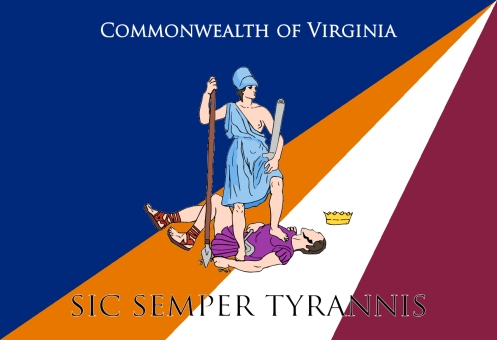
This might be a failure on premise for me, as I am not about to give up Virginia’s seal. It’s evocative and honestly a bit daring, with bare breasts and murder and an explicit threat to kill oppressors. As a Virginian, I believe this is a legacy the commonwealth rarely lives up to, but should serve as a constant reminder of what our values should be. And there are other flags with seals and figures striking or cool enough – California, Wales, Zheleznogorsk – to break these rules and stand on their own, and I think our Amazon belongs in the club.
But… it can go off to the side a little.
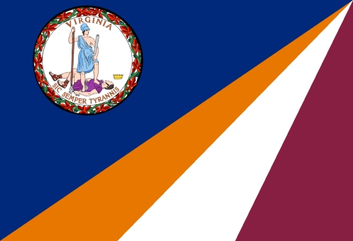
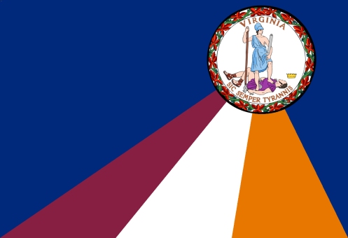
They both present the additional state colors on the field – orange and maroon, in addition to blue. These are the UVA and Tech colors, incidentally, and I separated them with a white field in part as a visual buffer and in part because if you put the two school colors together directly I’d probably never hear the end of it.
But also, the triangle of three colors quickly represents the shape of Virginia and its geographic “grand divisions” in a roughly accurate way. Moving the seal to the canton emphasizes more of the triangle, whereas setting it as a charge on the right allows the triangle to emanate from the seal, as if the warrior woman had taken her stand against tyranny atop a summit – albeit at the possible expense of a symbolic Eastern Shore.
Both of these choices are very rough drafts, obviously. I would really like a more curved triangle, which would be even more geographically evocative and add more dynamism to the flag – not quite a swoosh, but implying a rising star.
I would love to know what other people think about this basic idea.


Recent Comments